Toggletip
Toggletips display and hide additional information upon the click of a UI trigger element and can contain interactive elements.
Accessibility testing statusFor every latest release, Carbon runs tests on all components to meet the accessibility requirements. These different statuses report the work that Carbon has done in the back end. These tests appear only when the components are stable.
For every latest release, Carbon runs tests on all components to meet the accessibility requirements. These different statuses report the work that Carbon has done in the back end. These tests appear only when the components are stable.
Latest version: ^1.60.1 | Framework: React (@carbon/react)
| Component | Accessibility test | Status | Link to source code |
|---|---|---|---|
| Toggletip | Test(s) that ensure the initial render state of a component is accessible. | Passes all automated tests with no reported accessibility violations. | GitHub link |
| Tests that ensure additional states of the component are accessible. This could be interactive states of a component or its multiple variants. | Automated or manual testing has been temporarily deferred. | ||
| Tests that ensure focus is properly managed, and all interactive functions of a component have a proper keyboard-accessible equivalent. | Passes all automated tests with no reported accessibility violations. | ||
| This manual testing ensures that the visual information on the screen is properly conveyed and read correctly by screen readers such as JAWS, VoiceOver, and NVDA. | A human has manually tested this component, e.g. screen reader testing. |
What Carbon provides
Carbon already incorporates accessibility into the toggletip component. Designers only need to indicate the toggletip’s content.
Keyboard interactions
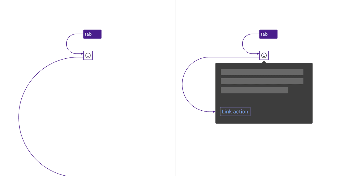
Toggletips use an information icon button for the trigger. These buttons are in
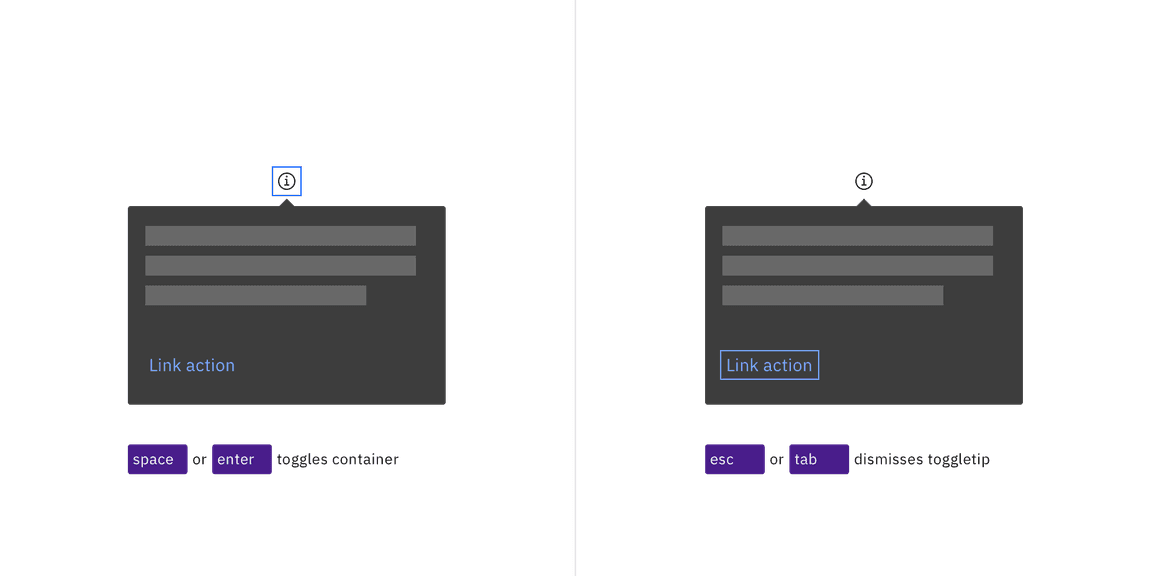
the tab order and are activated by pressing Enter or Space. The activation
toggles the tip open and closed, and focus remains on the trigger.
When the toggletip contains interactive elements, pressingTab will move focus
to the first component in the toggletip. When the toggletip only has
non-interactive text, or when the focus is on the last component in the
toggletip, pressing Tab will close the toggletip and move focus to the next
tab stop on the page. Pressing Esc also closes an open toggletip and returns
focus to the trigger if the focus is inside the tooltip.

The information icon button that triggers the toggletip is in the page tab order, as are interactive elements inside an open toggletip.

Toggletips appear when the information icon button is activated and disappear by activating the icon again, pressing Esc, or tabbing away from the toggletip.
Development considerations
Keep these considerations in mind if you are modifying Carbon or creating a custom component.
- The icon button has
aria-label="Show information". - The button uses
aria-expandedto set toggletip visibility andaria-controlsto handle navigation to the content.